There are now matchup boxscores on stats.nba.com. It can be a little hard to get a lot out of reading the data table as shown on the site. I saw a tweet from Seth Partnow with some charts showing the data in an easy to interpret fashion and decided to write some quick and dirty python code to generate the same charts. The example below is the Toronto Raptors defensive matchups in their season opener against New Orleans.
import matplotlib.pyplot as plt
import requests

%matplotlib inline
HEADERS = {
    'User-Agent': 'Mozilla/5.0',
    'referer': 'http://stats.nba.com/',
    'Accept-Language': 'en'
}
BASE_URL = 'https://stats.nba.com/stats/boxscorematchups'
game_id = '0021900001'
team_id = 1610612761
def get_game_matchups(game_id):
    params = {'GameID': game_id}
    response = requests.get(BASE_URL, params=params, headers=HEADERS, timeout=10)
    headers = response.json()['resultSets'][0]['headers']
    rows = response.json()['resultSets'][0]['rowSet']
    return [dict(zip(headers, row)) for row in rows]
game_matchups = get_game_matchups(game_id)
def get_players_with_matchups_for_team(team_id, matchups):
    team_matchups = {}
    def_players = []
    off_players = []
    for matchup in matchups:
        if matchup['DEF_TEAM_ID'] == team_id:
            pct_off_total_time = matchup['PCT_OFF_TOTAL_TIME']
            pct_def_total_time = matchup['PCT_DEFENDER_TOTAL_TIME']
            pct_both_on_total_time = matchup['PCT_TOTAL_TIME_BOTH_ON']
            def_name = matchup['DEF_PLAYER_NAME']
            off_name = matchup['OFF_PLAYER_NAME']
            if def_name not in team_matchups.keys():
                team_matchups[def_name] = {}
                def_players.append(def_name)
            team_matchups[def_name][off_name] = {
                'pct_off_total_time': pct_off_total_time,
                'pct_def_total_time': pct_def_total_time,
                'pct_both_on_total_time': pct_both_on_total_time
            }
            if off_name not in off_players:
                off_players.append(off_name)
    return def_players, off_players, team_matchups
# use def_players and off_players to keep order the same when formatting data for plot
def_players, off_players, team_matchups = get_players_with_matchups_for_team(team_id, game_matchups)
def get_formatted_data_for_type(on_off_type):
    return [
        [
            team_matchups[def_player][off_player].get(on_off_type, 0) if off_player in team_matchups[def_player].keys() else 0
            for off_player in off_players
        ]
        for def_player in def_players
    ]
both_on = get_formatted_data_for_type('pct_both_on_total_time')
def_on = get_formatted_data_for_type('pct_def_total_time')
off_on = get_formatted_data_for_type('pct_off_total_time')
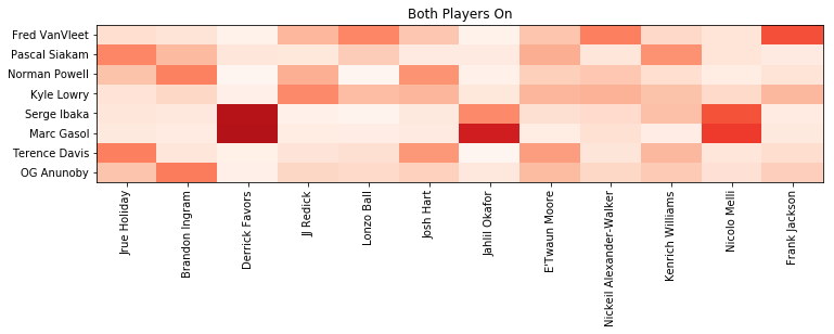
First we will chart the percentage of total time spent guarding opponent players when both players shared the court.
fig, ax = plt.subplots(1, figsize=(len(off_players), len(def_players)/3))

c = ax.pcolormesh(both_on, cmap='Reds', vmin=0, vmax=1)
ax.set_title('Both Players On')
# centre axis ticks
ax.set_xticks([float(n) + 0.5 for n in range(len(off_players))])
# label ticks with player names
ax.set_xticklabels(off_players, rotation=90)
ax.set_yticks([float(n) + 0.5 for n in range(len(def_players))])
ax.set_yticklabels(def_players)

plt.show()
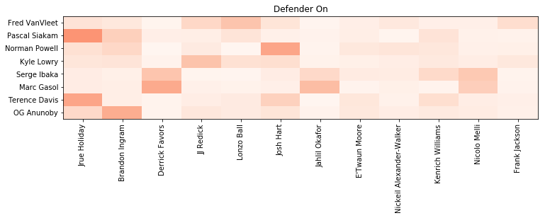
Now let’s look at the percentage of total time spent guarding opponent players when the defensive player was on the floor.
fig, ax = plt.subplots(1, figsize=(len(off_players), len(def_players)/3))

c = ax.pcolormesh(def_on, cmap='Reds', vmin=0, vmax=1)
ax.set_title('Defender On')
ax.set_xticks([float(n) + 0.5 for n in range(len(off_players))])
ax.set_xticklabels(off_players, rotation=90)
ax.set_yticks([float(n) + 0.5 for n in range(len(def_players))])
ax.set_yticklabels(def_players)

plt.show()
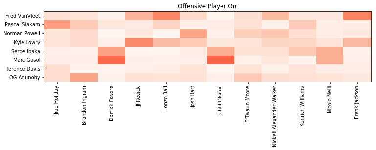
And finally, let’s look at the percentage of total time spent guarding opponent players when the offensive player was on the floor.
fig, ax = plt.subplots(1, figsize=(len(off_players), len(def_players)/3))

c = ax.pcolormesh(off_on, cmap='Reds', vmin=0, vmax=1)
ax.set_title('Offensive Player On')
ax.set_xticks([float(n) + 0.5 for n in range(len(off_players))])
ax.set_xticklabels(off_players, rotation=90)
ax.set_yticks([float(n) + 0.5 for n in range(len(def_players))])
ax.set_yticklabels(def_players)

plt.show()
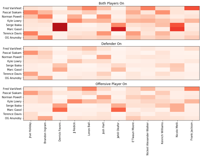
This is what it looks like with all three options on the same chart.
fig, (ax1, ax2, ax3) = plt.subplots(3, figsize=(len(off_players), len(def_players)))

c = ax1.pcolormesh(both_on, cmap='Reds', vmin=0, vmax=1)
ax1.set_title('Both Players On')
ax1.set_xticks([])
ax1.set_yticks([float(n) + 0.5 for n in range(len(def_players))])
ax1.set_yticklabels(def_players)

c = ax2.pcolormesh(def_on, cmap='Reds', vmin=0, vmax=1)
ax2.set_title('Defender On')
ax2.set_xticks([])
ax2.set_yticks([float(n) + 0.5 for n in range(len(def_players))])
ax2.set_yticklabels(def_players)

c = ax3.pcolormesh(off_on, cmap='Reds', vmin=0, vmax=1)
ax3.set_title('Offensive Player On')
ax3.set_xticks([float(n) + 0.5 for n in range(len(off_players))])
ax3.set_xticklabels(off_players, rotation=90)
ax3.set_yticks([float(n) + 0.5 for n in range(len(def_players))])
ax3.set_yticklabels(def_players)

plt.show()