Not all shots are equal. While you get 2 points for both a breakaway dunk and a tightly guarded, off-balance 20 foot jumper, the dunk is the more valuable shot because it is going to be made nearly every time. Multiple people have created shot quality models to estimate the probability a shot is made based on various factors. You can read about some of them here and here . The better public models all used the no longer public SportVU shot logs. Now the models that use factors like closest defender distance and touch time, like ESPN’s Quantified Shot Quality(qSQ), are proprietary and not readily accessible.
While shot level data is no longer available for some of these important features, there is still a lot that can be gleaned from play-by-play data. With play-by-play data we can figure out, for each shot, how the possession started, the time since the possession started and the location of the shot. Using these features we should be able to create a model to estimate the probability of each shot being made that does better than using only shot location. My goal in building my own model is to create a shot quality metric that is easily available for anyone to look up on PBPStats for all the possible queries and filters. While you can get shooting stats by how open shots are on stats.nba.com , it’s not easy get those stats beyond the season-level. While this model may not be as good as some of the proprietary models, by adding in features from play-by-play data, it is better than what is publicly available and easily accessible. The model output on PBPStats can be found on the Scoring and Shooting tabs and can be interpreted as an expected effective field goal percentage based on shot location and play context.
What is included in the model:
- Shot Distance
- Shot Angle (0 for straightaway shots, 90 from the corners)
- Seconds since play started
- Time remaining in period
- Period
- Score differential
- Putback (a shot by the player who got the offensive rebound within 2 seconds of getting the rebound)
- Regular Season / Playoffs
- Play Start Type
- Off Deadball
- Off Live Ball Turnover
- Off Block
- Off Made FG
- Off Missed FG
- Off FT Make
- Off FT Miss
- Off Timeout
- Off Oreb
- Off FT Oreb
- Off Team Oreb
- Off Blocked Oreb
- Off Team Blocked Oreb (these are separate from other team rebounds since the shot clock won’t have been reset)
What is not included in the model:
- Closest defender distance
- Touch time
- Who the shooter is
To evaluate model performance I used log loss . I built three separate models, one for shots in the restricted area, one for two point shots outside the restricted area and one for all three point shots(excluding shots from 35+ feet). As a baseline I created a very simple model grouping shots by shot zone - by distance for two point shots and by corner/above the break for three point shots, and predicting every shot to be made at the average value for the shot zone. For the 2017-18 season, this simple model has a log loss of 0.662 for all shots. For just shots in the restricted area the log loss is 0.659, for two point shots outside the restricted area the log loss is 0.674 and for three pointers the log loss is 0.656. Any new model we create should aim to beat these.
Each season has a different model that is trained using the shots from the previous four seasons. Each model is an ensemble model of two gradient boosted tree models using XGBoost and CatBoost . I tried including other models in the final ensemble model but none of them improved the overall model performance.
Model Results
Here is a summary of the log loss for each model for each season along with the log loss for all shots.
| Season | Restricted Area Log Loss | 2pt Non-Restricted Area Log Loss | 3pt Log Loss | All Shots Log Loss |
|---|---|---|---|---|
| 2017-18 | 0.6308 | 0.6720 | 0.6525 | 0.6518 |
| 2016-17 | 0.6197 | 0.6739 | 0.6503 | 0.6478 |
| 2015-16 | 0.6185 | 0.6709 | 0.6481 | 0.6461 |
| 2014-15 | 0.6242 | 0.6677 | 0.6453 | 0.6466 |
| 2013-14 | 0.6329 | 0.6686 | 0.6512 | 0.6516 |
| 2012-13 | 0.6348 | 0.6665 | 0.6503 | 0.6514 |
| 2011-12 | 0.6340 | 0.6648 | 0.6446 | 0.6495 |
| 2010-11 | 0.6356 | 0.6692 | 0.6450 | 0.6534 |
| 2009-10 | 0.6523 | 0.6728 | 0.6481 | 0.6602 |
| 2008-09 | 0.6583 | 0.6719 | 0.6555 | 0.6636 |
| 2007-08 | 0.6545 | 0.6717 | 0.6535 | 0.6619 |
| 2006-07 | 0.6517 | 0.6702 | 0.6505 | 0.6596 |
| 2005-06 | 0.6558 | 0.6694 | 0.6507 | 0.6609 |
| 2004-05 | 0.6537 | 0.6666 | 0.6491 | 0.6588 |
| 2003-04 | 0.6552 | 0.6621 | 0.6428 | 0.6562 |
| 2002-03 | 0.6517 | 0.6648 | 0.6465 | 0.6573 |
| 2001-02 | 0.6540 | 0.6659 | 0.6472 | 0.6587 |
Issues With Data
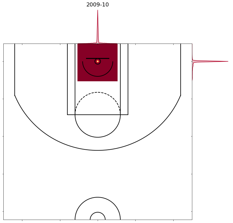
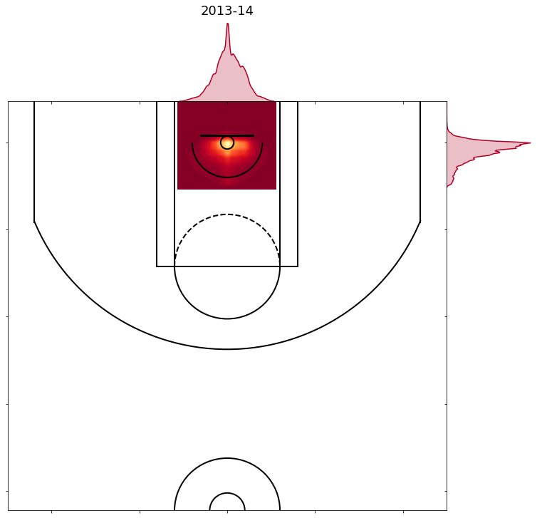
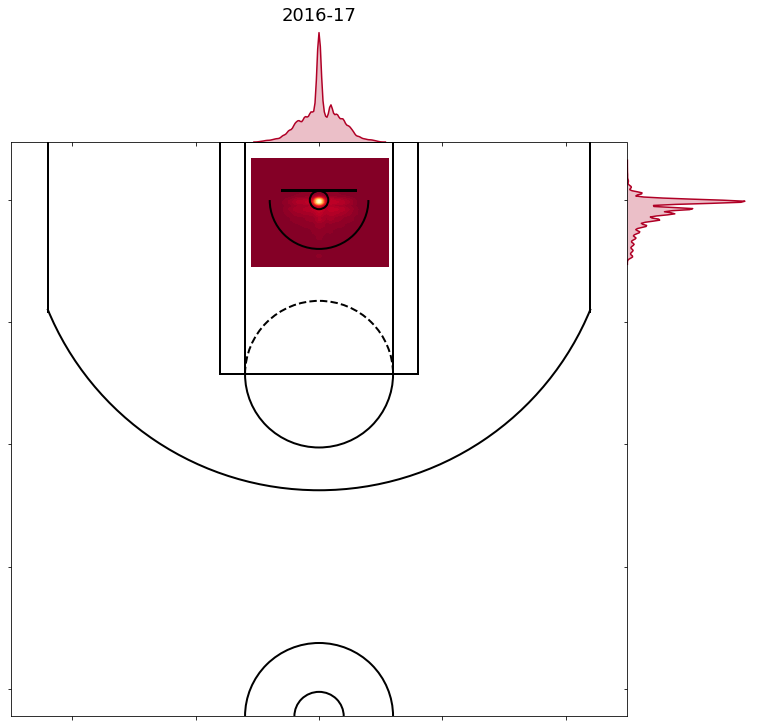
As you can see in the table above, the log loss for shots in the restricted area varies a lot more than the log loss for other models. The reason for this is the shot locations of shots right at the rim vary by year. Here are how the four different ways the coordinates on shots in the restricted area have been labeled over the years.
- 2001-02 to 2009-10 are all similar to the chart below, with over two thirds of all shots in the restricted area labeled as being taken right from the centre of the hoop. These are the years with the worst model predictions and considering the majority of shots in the restricted area are labeled as being taken from the exact same spot that isn’t surprising.
- 2010-11 to 2013-14 are all similar to the chart below, with shots more evenly distributed. In these years the predictions start to improve due to presumably better shot location data.
- 2014-15 to 2016-17 are all similar to the chart below, with around 15% of shots in the restricted area being taken right at the centre of the hoop and over 90% of those shots being made. In these years the model predictions improve even more. That’s probably explained by the fact that 90% of shots taken from the most commonly labeled location are made.
- 2017-18 looks like this, with the most common point now being moved to the back of the hoop, and 60% of those shots from the common point being made.

As a result, it makes it difficult to get a good prediction in years where the model was trained on data that has labeled the coordinates of shots at the rim in a different manner. I tried smoothing out some of the common points and rather than having them all at the centre or back of the hoop, randomly placing them anywhere in the hoop. This improved the model predictions for the 2017-18 season so the final model uses the smoothed points for that season but not for any other seasons. I’m guessing that the 2018-19 season data will resemble the 2017-18 season data, so no adjustments were made training the 2018-19 model.
Interpreting Models
A common criticism of tree based models is that you are sacrificing interpretability for prediction accuracy. Fortunately a newly developed tool called SHAP values allows us to better interpret these models without sacrificing accuracy. If you want to read more about SHAP Values you can read up on them here , here or here .
Here are some SHAP value summary plots, along with how to interpret them, for each model for 2017-18.
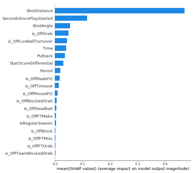
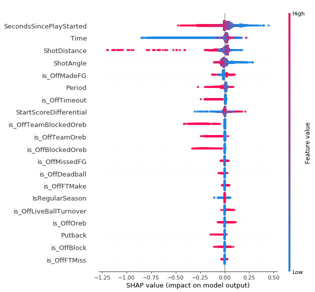
Restricted Area Model
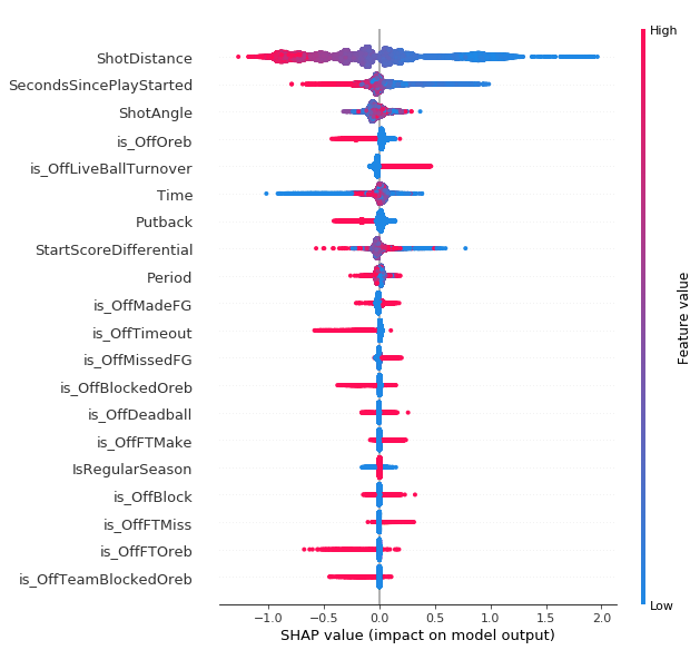
Each point is a single shot. Pink points represent a higher value for that feature. Points to the right represent a higher SHAP value which corresponds to an increased probability of making the shot. They are ordered top to bottom from most important to least important. Not surprisingly, shot distance is the most important feature - the closer to the hoop, the higher the probability of making the shot. Looking at the chart below, you can see that the magnitude of the importance of shot distance is by far the highest. I found it interesting that shots following offensive rebounds (“isOffOreb”) tended to have negative SHAP values. My guess for the reason for this would be that compared to normal shots at the rim, shots after offensive rebounds are probably more closely guarded. Also all the missed tip-in attempts when a player can’t get two hands on a rebound probably bring down the value of putback attempts. This doesn’t mean these shots are bad shots, it just means they aren’t as good as some other shots in the restricted area.
2pt Non-Restricted Area Model
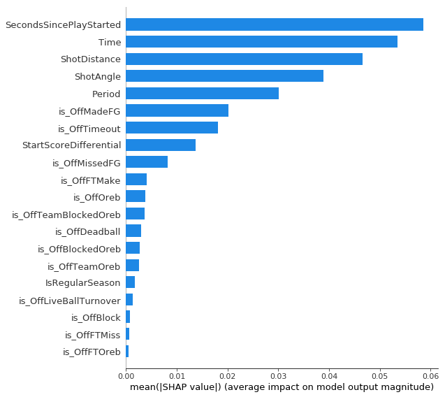
For two point shots outside the restricted area the number of seconds since the play started is the most important feature, even more important than shot distance. My guess would be that this picks up some of how open the shot is, as well as who the shooter is. Shots early in the shot clock are probably more likely to be open and more likely to be taken by better shooters. Time remaining in the period is second most important, probably due largely to the low value end of quarter shots.
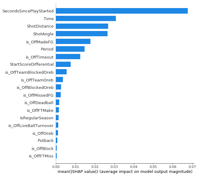
3pt Model
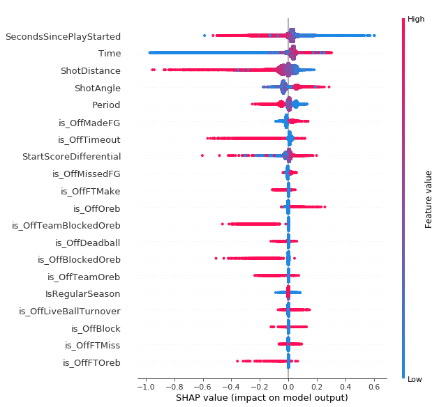
On three point shots the number of seconds since the play started and the time remaining in the period are the two most important features, just like for two point shots outside the restricted. Shot distance and shot angle are next. The closer/higher angle threes are corner threes and lots has been written about how corner threes are more valuable than above the break threes, so these results are expected. Period is the next more important with shots with high values (overtime) having negative SHAP values. This lines up with conventional wisdom that as your legs start to get tired you won’t shoot as well on jump shots. Although the magnitude is small shots after offensive rebounds tended to have positive SHAP values. This is also probably picking up openness to some degree.
So in general, even though openness isn’t in the model it is probably being picked up to a small degree based on the number of seconds since the play started and, to a smaller extent, the play context. It is also important to note that one of the shortcomings of SHAP values is dealing with features that are highly correlated. For example, when I look at all the three point shots with the highest probability of being made, nearly all of them are shots 1-2 seconds after an offensive rebound. It would be hard to get a three point attempt 1-2 seconds after any play start type other than an offensive rebound. This makes it tricky to properly “credit” the time since the play started or the play starting off an offensive rebound.
In terms of the actual model output, looking at the team stats for shot quality in 2017-18 and seeing Houston at the top of the list and Minnesota and Sacramento at the bottom is reassuring. On the defensive end seeing Utah number 1 and Phoenix number 29 passes the smell test as well.
Having a measure of shot quality that is easy to access and query for various filters can help provide more context for other research and analysis. For example you can use the possession finder to see how shot quality drops at the end of tight games. You use the WOWY filters how a team’s shot quality changes with different lineup combinations. You can view opponent stats to see which teams force opponents to take tougher shots. You can see how each teammate’s shot quality changes with a player on or off the floor .
Comparing to Model with Defender Distance
Since there was a time when there were more detailed shot logs with defender distance that were publicly available, I also built a model using that data. It was trained on data from the 2013-14 and 2014-15 seasons and tested on the half season of 2015-16 data that was available and it uses all the same features as this model along with closest defender distance and number of dribbles. Here is how that model performed:
- Restricted Area log loss: 0.6108
- 2pt non-Restricted Area log loss: 0.6681
- 3pt log loss: 0.6428
- All shots log loss: 0.6412
So the biggest area of improvement is on shots in the restricted area. This isn’t surprising because if you knew a shot in the restricted area was open it becomes near certain make. It does better on three point shots as well but since knowing the a three point shot is wide open doesn’t nearly guarantee a make, the improvement isn’t as large.
Potential Improvements
Perhaps splitting up the models even further - for the three point model, split up corner and above the break threes and for the non-restricted area model splitting up shots from floater range and long twos is worth exploring to see if it improves the model. Adding in the defensive players on the floor to account for the strength of the defense could also make things better.
Model Code
Inspired by the openness of Manny Perry of Corsica and Evolving Wild in sharing their data/code for their hockey research, I’m sharing the data and code used to make this model. Here are links to notebooks so you can recreate everything I have done from scratch yourself if you are curious or want to build your own, better, model. The data cleaning notebook has a note on how to get the data.